
Renewing a Trusted College Health Resource: Go Ask Alice! for Columbia Health
Go Ask Alice! answers the health questions college students will not ask anyone they know — anonymously, and for a global search audience far larger than Columbia’s own.

The work
The Challenge: The Questions Students Will Not Ask Anyone They Know
Go Ask Alice! answers the health questions college students will not ask anyone they know, and its distinctive value is that real health professionals research and write every answer — at exactly the moment AI-generated health content began filling the same searches. Some of the students reading it are on a device someone else can see.
The Strategy: Make It Safe, Make the Authorship Visible
Rebuilt on Drupal around three decisions: make the platform safe to use, make the human authorship structural, and give a small editorial team room to work.
- An escape route on every page. One click opens a new tab and scrubs the page from browser history. The module built for it — Quick Exit Button, shared with Mass Legal Help — was contributed back as open source.
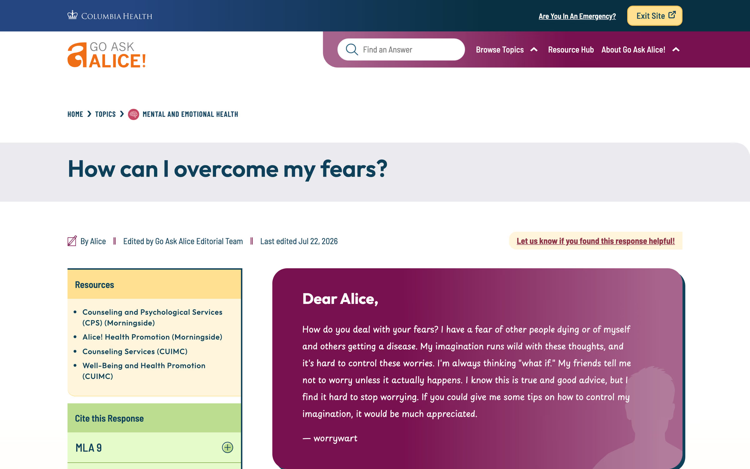
- Authorship moved above the answer. A handwritten face for the “Dear Alice” greeting, and editor names with publication and revision dates above the response rather than beneath it, so credibility lands before the reading starts.
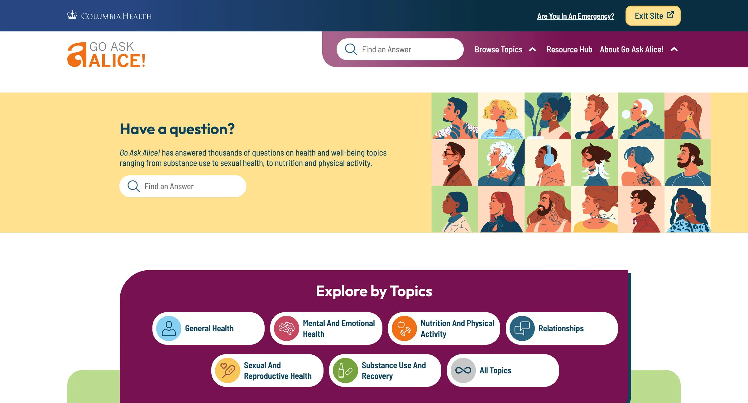
- Browsing made easier than asking. Topics and search lead, and the question form sits downstream of both, so the team is not re-answering answered questions.
The Outcomes: Trusted on Sight, Leaveable in One Click
A resource students can trust on sight, and leave in one click.
- Trust | Author, editor and revision date at the top of every answer | Maroon and yellow at WCAG 2.2 AA, with Columbia blue reduced so the resource stands on its own name
- Engagement | MLA and Chicago citations generated from each answer, so the work travels into coursework | Search-first browsing that routes students to existing answers before the question form
The detail
Why it mattered
- The design wasn’t speaking to the students it was written for. Gen-Z readers calibrate trust partly through design currency — mobile-first, fast, clear hierarchy, a current visual register. A platform that reads as dated loses credibility with an audience making that judgment in seconds, on a phone, often under stress.
- Human authorship was the value, and it wasn’t visible. Real health professionals research and write every answer. AI-generated health content had begun filling the same search results. The previous design put editor names and revision dates at the bottom of the page, which is after the point where a reader has already decided whether to believe it.
- The editorial team was spending its capacity on the wrong work. A small team manages a growing library. The content architecture required lengthy workarounds and the spam filtering on user submissions was ineffective, so time that should have gone into answers went into process instead.
- Some readers are not alone with the screen. Questions arrive from students in active difficult situations — abuse, suicidal ideation, substance dependence, eating disorders — and some of them are reading on a device someone else can see. Helpful to read is not the same as safe to use.
How it was built
- An escape route on every page. One click opens a new tab and scrubs the site’s page from the device’s browser history. It exists for the moment a student reading about an abuse situation needs the screen to stop showing it. The module built for it was shared with Mass Legal Help and contributed back to Drupal as open source.
- Authorship moved above the answer. A handwritten face for the “Dear Alice” greeting signals a person responding to a person. Editor names, publication dates and revision dates moved from the bottom of the answer to the top, so credibility is established before the reading starts rather than confirmed after it.
- A palette that lets the resource stand on its own name. The previous site leaned on Columbia Health blue, which kept Go Ask Alice! reading as a department rather than as the thing students search for. Maroon and yellow became primary, with additional colors marking wayfinding across topics, and every combination conforms to WCAG 2.2 AA. A new illustration system represents the actual range of the student population, with random footer illustrations adding small moments of surprise.
- Browsing made easier than asking. Students arrive from Google with one question, and analytics showed most found their answer and left — satisfying for them, and a miss for everything else the library offered. Topics lead, related answers surface alongside, and the “Ask a Question” route sits deliberately downstream of search — visitors meet it only after looking. The team stops re-answering answered questions.
- Citations, because the answers travel. Each answer generates a proper MLA or Chicago citation. Answers cited in coursework reach an audience direct site visits do not.
What it offers now
- The escape route is on every page, still. “Exit Site” sits in the Columbia Health bar beside “Are You In An Emergency?”, on the homepage and on every answer.
- The safety pattern outlived the engagement. It was released on Drupal.org as the Quick Exit Button module, filed under Accessibility, and 11 sites now report using it. Its documentation cites the published research on quick-exit patterns and is candid about what the pattern still cannot do — which history it can and cannot scrub, and the risk of putting the control where it is not needed.
- The byline reads before the answer does. Author, editor and last-edited date sit above the response, and the handwritten greeting is the first thing on it.
Student health platform questions
What is a quick exit button, and when does a website need one?
A control that opens a new tab in one click and scrubs the site’s page from the device’s browser history. It exists for readers who are not alone with the screen — a student reading about an abuse situation on a device someone else can see. The pattern built for Go Ask Alice! was contributed back to Drupal as the open-source Quick Exit Button module, which 11 sites now report using.
How does a health website show its answers are written by people?
By making authorship structural rather than a footnote. On Go Ask Alice!, editor names, publication dates and revision dates sit above the answer instead of beneath it, and a handwritten “Dear Alice” greeting signals a person responding to a person — so credibility is established before the reading starts, at exactly the moment AI-generated health content fills the same search results.
How should a student health resource be organized?
Search and topics first, the question form last. Students arrive from Google with one question; related answers surface alongside, and the “Ask a Question” route sits deliberately downstream of search — so visitors meet it only after looking, and a small editorial team stops re-answering answered questions.
Why does visual design matter for health content credibility?
Because Gen-Z readers calibrate trust partly through design currency — mobile-first, fast, a current visual register — and they make that judgment in seconds, on a phone, often under stress. A platform that reads as dated loses credibility before a word of its carefully researched answers is read.
What makes a college health website effective?
For the Go Ask Alice! redesign by Pare & Co: an escape route on every page, authorship above every answer, a WCAG 2.2 AA palette that lets the resource stand on its own name, citations that travel into coursework, and a safety pattern released as open source that outlived the engagement.
Client leadership

Matthew O’Bryant
Matthew O’Bryant has led the work on health resources that people arrive at with a question they would rather not ask anyone.