
Connecting Survivors to Legal Help They Can Reach Safely: A Legal Aid Platform for the Massachusetts Law Reform Institute
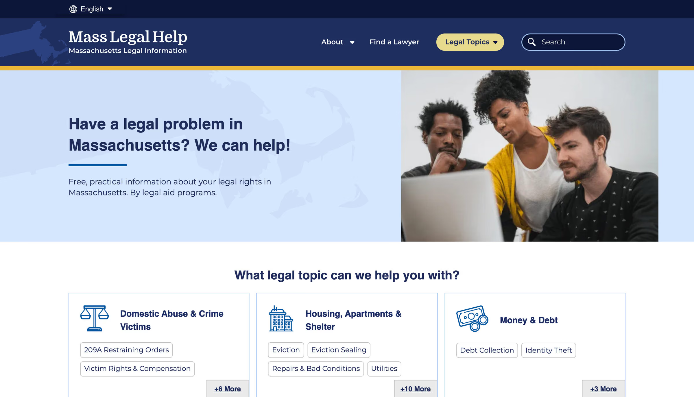
Mass Legal Help is the legal information resource for people in crisis across Massachusetts — eviction defendants, domestic violence survivors, immigrants navigating legal process, low-income residents accessing benefits. We rebuilt the platform to be trustworthy, accessible and safe to use. Including a button that lets a survivor exit the page in a second when they need to.

The work
The Challenge: The Reader Is in Crisis, and Sometimes Not Alone With the Screen
Mass Legal Help is where Massachusetts residents go when they are facing eviction, abuse, custody loss or a benefits denial without a lawyer — mostly low-income, often not native English speakers, usually landing from a Google search on a page deep inside the site, on a phone. Fifteen years of active maintenance had kept the content current and left the design, navigation and accessibility behind, and the platform had none of the safety affordances its audience’s actual conditions demand.
The Strategy: Rebuild From the Audience’s Conditions Outward
Rebuilt on Drupal from the audience’s conditions outward rather than from the sitemap in.
- Accessibility as the design constraint, at WCAG 2.1 AAA. For readers who skew older, lower-bandwidth, limited-English and assistive-technology-dependent, the highest level in the standard is the condition under which the platform works at all.
- Navigation built for arrival, not for browsing. Topics and search lead, and related issues surface across categories, because most visitors land deep from a search engine with one question already formed.
- An escape route, engineered. One action to leave the page and scrub the site from the device’s visible history, for the reader who is not alone with the screen.
The Outcomes: Usable in Crisis, and a Safety Pattern Set Free
A platform its audience can use under the conditions they are actually in, and a safety pattern that did not stay proprietary.
- Trust | Rebuilt to WCAG 2.1 AAA, the highest level in the standard | Safety treated as infrastructure rather than as a feature request
- Engagement | Topic-first navigation and search, built for visitors who arrive deep from Google | The escape pattern contributed back to Drupal as Quick Exit Button, where 11 sites now report using it
The detail
Why it mattered
- The audience’s ability to use it changes what happens to them. A tenant who cannot find the eviction-defense information loses their housing. A survivor who cannot reach protective-order information may lose a protection she is entitled to. An immigrant who cannot navigate their own situation may lose status or work authorization. The platform does not only inform a decision — its clarity decides whether people get the help the legal system is meant to provide.
- A dated design was reading as dated information. Visitors arriving in stressful circumstances form a judgment about a platform’s authority within seconds. Fifteen years of active maintenance had kept the content current and had not kept the design current, so the platform looked less reliable than it was — a credibility problem created by the surface rather than the substance.
- Navigation was built against how the audience arrives. Research found most visitors come from a Google search with a specific question, land on pages three or more levels down the site’s structure, and are frequently on mobile using text-to-speech. The previous structure — wall-to-wall topic categories on desktop, table-of-contents secondary navigation that blocked cross-category movement — answered a different pattern of use.
- Accessibility had to be the precondition, not the pass at the end. The audience disproportionately includes older adults, people with visual or cognitive disabilities, people with limited English, people on slow connections, people using assistive technology. For this audience WCAG 2.1 AAA — the highest level in the standard — is not an aspiration. It is the condition under which the platform works at all.
- Some people read this site on a device someone else can see. A survivor reading about protective orders may be on a shared phone, and the person she is reading about may walk into the room. The platform’s job in that second is to disappear: off the page, out of the visible history, fast enough that the screen gives nothing away. That is safety infrastructure, not a UX consideration, and the previous platform had none of it.
How it was built
- Discovery ran on the audience’s own voice. Working group interviews, visitor interviews, cohort site analysis, and wireframe and prototype testing with people who fit the primary and secondary audience profiles. One visitor put the whole brief in three sentences: “I’m coming here because I have a problem. I want to know, where’s the search? What can I do here?”
- Plain language as policy, not preference. The content is written at a fourth-to-sixth-grade reading level instead of in legal jargon, with many resources professionally translated — Spanish among them — because a site for people in crisis has no business making them decode it.
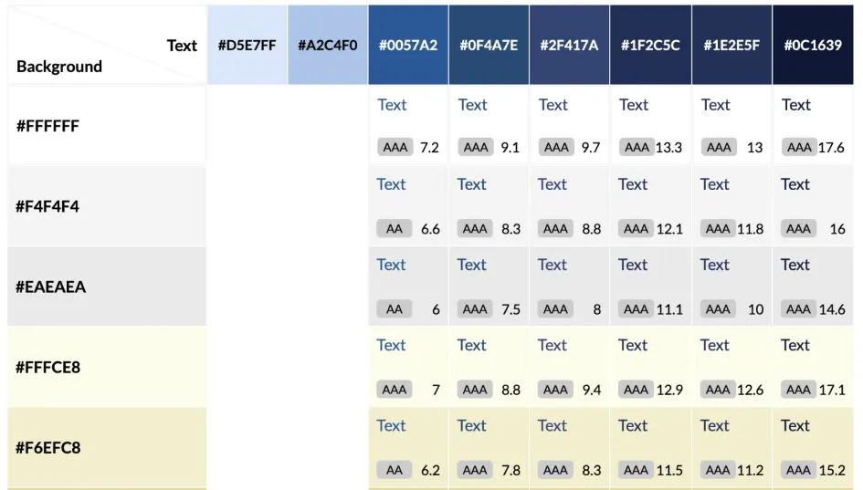
- Accessibility as the design constraint. Rebuilt to WCAG 2.1 AAA rather than to the AA that most public-sector work stops at, because the audience profile made the highest level the working requirement.
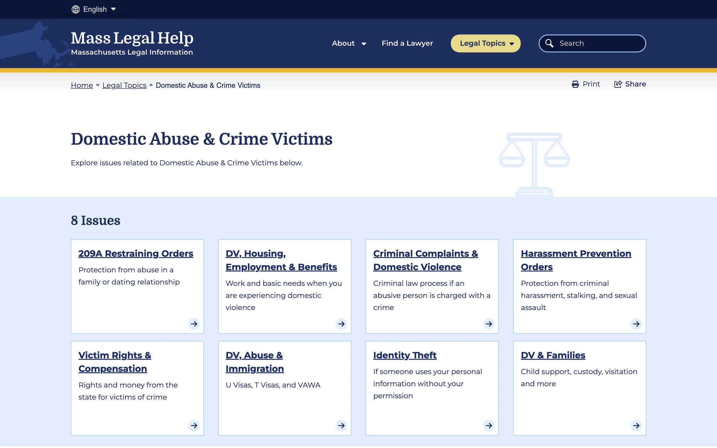
- Navigation rebuilt around arrival. Topics and search lead, related issues surface across categories instead of inside a fixed table of contents, and the structure assumes a visitor who landed deep from a search engine on a phone rather than one browsing from the homepage down.
- A visual identity sized to the institution’s actual authority. The redesign kept the trusted blue palette in softer tones — authoritative and calming at once — and limited photography to images representing the people the service actually serves. The gap between how current the information was and how current it looked closed, for an audience that reads the two as the same signal.
- Icons and filters that work in any language. Every topic and content type — articles, how-tos, e-books, videos — has its own icon and color, so a visitor can orient by picture before they parse a word of English. Multi-filter search crosses topic and content type, and a “Viewers also reviewed” component surfaces related answers for the visitor who landed deep inside the site.
- A safety net above the footer. A repeating help footer meets the visitor who scrolled to the end of a page without finding what they needed, so the end of the page is never the end of the route.
- An escape route, engineered rather than bolted on. One action to leave the page and scrub the site’s browsing history from the device, built for the reader who is not alone with the screen. The module was shared with Columbia Health’s Go Ask Alice and released as open source.
What outlived it
- The escape pattern became a public Drupal module. Quick Exit Button, filed on Drupal.org under Accessibility and created in April 2024. Eleven sites report using it. It is available to any organization publishing information that could put a reader at risk of retaliation.
- It documents its own limits, which is the part that matters. The module’s page cites the published evaluation of quick-exit buttons and the UK government’s pattern, and is explicit about what it cannot do: it scrubs the history of the page it was used on rather than the whole site, and putting the control on a site that does not need it can tell the wrong person that it does.
- The platform is still the front door. Mass Legal Help runs today in English and Spanish, organized by the topics people search for — housing, domestic abuse, money and debt, benefits, immigration — with a route to a lawyer alongside the information.
Legal aid website design questions
Why build a legal aid website to WCAG 2.1 AAA?
Because of who is reading. The audience disproportionately includes older adults, people with visual or cognitive disabilities, people with limited English and people on slow connections using assistive technology — so the highest level in the standard is not an aspiration, it is the condition under which the platform works at all. The palette was documented pair by pair in a contrast grid to prove it.
What reading level should legal information be written at?
Mass Legal Help writes at a fourth-to-sixth-grade reading level instead of legal jargon, with many resources professionally translated. Icons give every topic and content type a picture a visitor can orient by before parsing a word of English — a site for people in crisis has no business making them decode it.
What is a quick exit button, and when does a site need one?
One action that leaves the page and scrubs the site from the device’s visible history — built for a survivor reading about protective orders on a device someone else can see. The pattern built here was released as the open-source Quick Exit Button Drupal module, which 11 sites now report using, and its documentation is explicit about what the pattern can and cannot do.
How should a legal aid site be organized?
Around how people arrive. Research showed most visitors come from a Google search with a specific question, land on pages three or more levels down the site’s structure, and are often on a phone using text-to-speech — so topics and search lead, related issues surface across categories, and a repeating help footer meets anyone who reaches the end of a page without an answer.
What does a good legal aid website look like?
For the Mass Legal Help rebuild by Pare & Co: a platform rebuilt to WCAG 2.1 AAA with plain-language content its audience can actually use, navigation built for deep arrival, safety treated as infrastructure and an escape pattern contributed back to Drupal where it now protects readers on other sites.
Client leadership

Matthew O’Bryant
Matthew O’Bryant’s specialty is audit-grade delivery, and accessibility is where that standard is least negotiable — a survivor who cannot reach the page is not served at all.