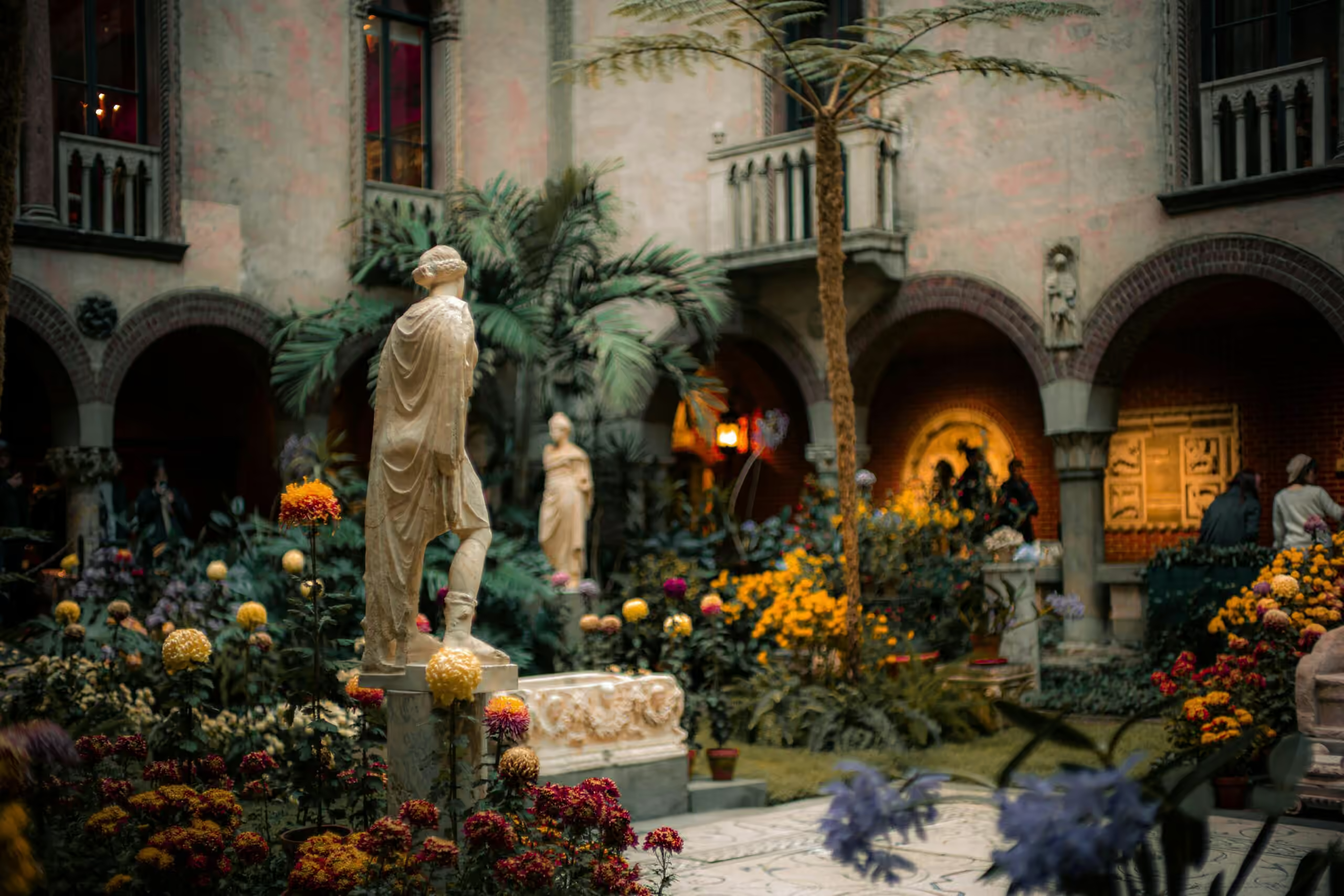
Reimagining a Beloved Cultural Destination: A Platform Rebuild for the Isabella Stewart Gardner Museum
The Isabella Stewart Gardner Museum’s staff had started using Google to find content on their own website. The diagnosis was in the symptom. The work underneath was rebuilding the digital surface of a 120-year-old institution without flattening what makes it distinctive.

The work
The Challenge: A Museum Website Its Own Staff Navigated by Google
The Isabella Stewart Gardner Museum’s own staff had started using Google to find content on the Museum’s website — a structural failure stated as a small daily habit. Underneath it sat the harder problem: the site had to work as the contemporary front door of a 120-year-old institution, handling ticketing, planning and member services, while bringing the character of a place whose whole identity is being unlike anywhere else into a medium that defaults to flatness. And it had to do both to WCAG 2.2 AA, a standard the old site failed, a contradiction for an institution founded on inclusive access.
The Strategy: Rearchitecting the Museum Website, Structure First
Not a redesign. A rearchitecture of how the Museum operates online, built on Drupal to scale as the audience and the content do.
- Information architecture validated before visual design. Navigation and hierarchy rebuilt structurally, then tree tested in Optimal Workshop — so the structure is not reverse-engineered from a layout.
- Components built to WCAG 2.2 AA from the start. Accessibility as a construction constraint rather than a retrofit, for an institution with access as a founding value.
- A “gentle elegance” translation of the Gardner’s character. Lace and mosaic detail giving the components personality without overwhelming content, so the site reads as the Gardner’s rather than as a theme.
The Outcomes: Exhibition Page Views Up 179.7% in Three Weeks
Within three weeks of launch, every key visitor behavior had moved. Homepage engagement time rose 15.6%, exhibition page views rose 179.7%, and engagement time on the “Inside the Collection” series rose 61.7%: visitors finding their way past the transaction and into the content that brings them back. The rebuilt site took a w3 Silver among cultural institutions.
The operational change runs as deep as the metrics. Staff find and update content without external search tools, so publication cycles run at the Museum’s pace, and clear analytics over an accessible, logically structured platform make ongoing optimization ordinary work. A digital surface the Museum’s own people can navigate, and a visitor can enter from either direction.
The detail
Why it mattered
- The staff had started using Google to find content on their own website. That is not a content-management complaint. If the people who built, run and maintain the site cannot navigate it, no visitor can either. The internal-search workaround was the symptom; the architecture was the cause.
- The site failed WCAG 2.2 AA. For an institution whose founding commitment is inclusive access, that was not a compliance gap. It was a contradiction.
- Information architecture was scattered. Exhibition details, ticketing and visitor resources connect to each other in the way a person actually plans a trip, and the site treated them as separate territories. Friction accumulated at every decision point.
- The component system was inflexible. Editorial workarounds undermined performance and broke brand coherence. The team was managing the platform’s limitations more than the Museum’s content.
- Pathways were transactional rather than exploratory. A visitor who came to buy a ticket left having bought a ticket. The collection, the exhibitions, the membership — every reason to come back — sat one click off the path everyone actually walked.
- Most museum websites look like museum websites. The Gardner’s physical experience is its identity: no labels, personal curation, intimate scale, a single founder’s intentionality. A site that looks like every other cultural institution’s subtracts from a place defined by being unlike anywhere else, and there is no neutral version.
How it was built
- Alignment before architecture. Stakeholder workshops across curatorial, education, development, visitor experience and marketing set shared priorities and success metrics, synthesized from member surveys, analytics and internal insight. Cultural institutions run on competing internal voices, and the alignment work is what made the rearchitecture defensible across them.
- Journeys mapped for the audiences the platform actually serves. Members, first-time ticket buyers, on-site visitors, online researchers. Each uses the surface differently, and the architecture had to serve all four without privileging one.
- Information architecture validated before visual design, not after. Navigation and menu hierarchy were rebuilt structurally and then tree tested in Optimal Workshop, ahead of any layout work. The order is the point: design first and validate later, and the structure ends up reverse-engineered from the layout.
- Components built to WCAG 2.2 AA from the start. Accessibility as a construction constraint rather than a retrofit, which is the only version that works for an institution with access as a founding value. The result argues that accessibility and aesthetic quality reinforce each other rather than compete.
- A “gentle elegance” design philosophy. The piece most agencies would have skipped. The Gardner’s character — intimate, layered, unconventional — translated into lace patterns and mosaic elements that give the components personality without overwhelming content, so the site reads as the Gardner’s rather than as a theme.
- The Visit page reimagined as a door rather than a checkout. Practical planning still completes cleanly, and the architecture now opens routes into collection content, exhibitions and membership at the moment a visitor’s interest is highest.
What it looks like now
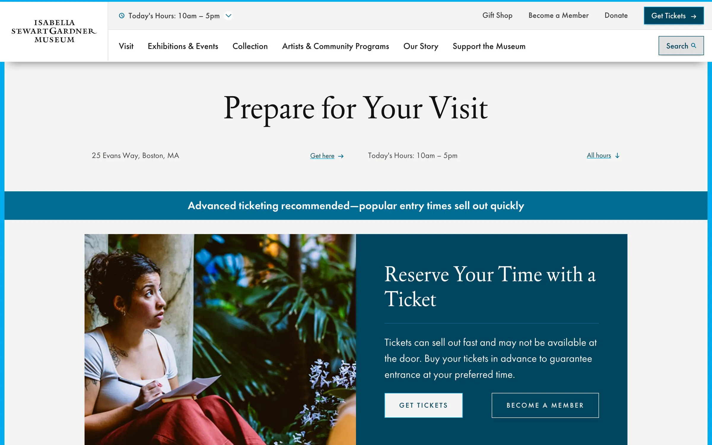
- The navigation is six items, and a visitor can name all of them. Visit, Exhibitions & Events, Collection, Artists & Community Programs, Our Story, Support the Museum. Hours, tickets, membership and donation sit above it, so the transactional path never has to be found inside the editorial one.
- Planning and exploring share the same page. Prepare for Your Visit opens on address, directions and hours and moves into ticketing, membership and the reasons to stay — the transactional task completing without closing the door behind it.
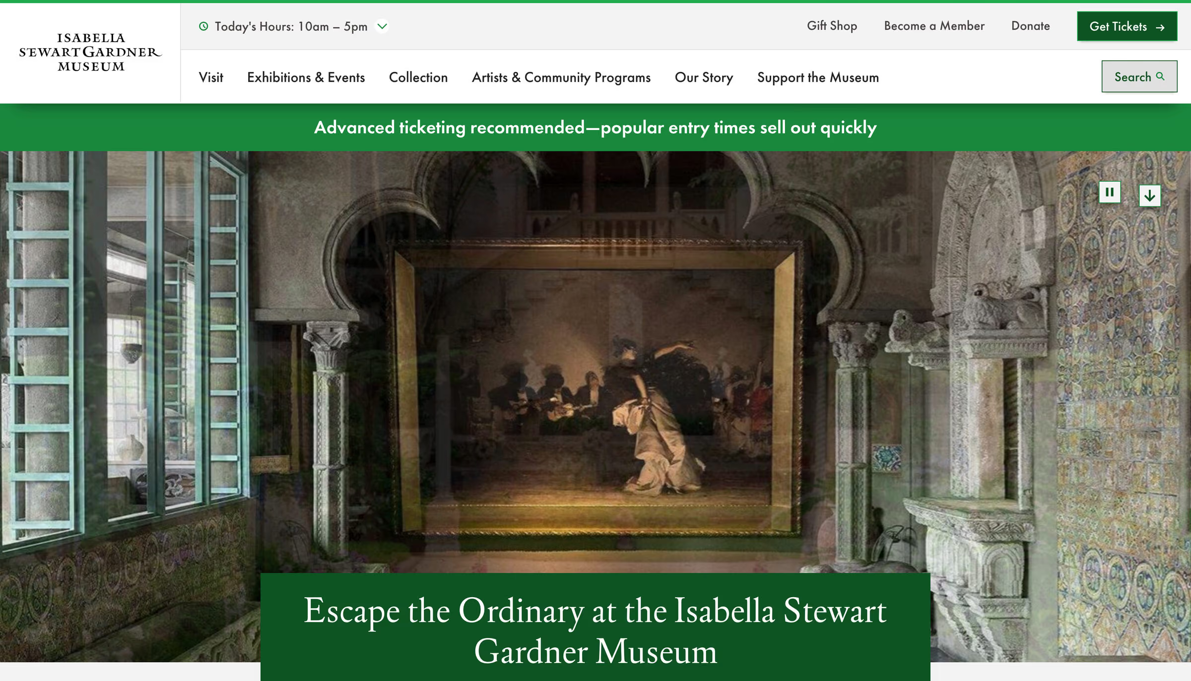
- The Museum’s own rooms front the site. The hero is the courtyard galleries rather than stock institutional photography, which is the difference between modernizing an institution and replacing it.
- Staff work in their own site again. Content is found and updated without external search tools, so publication cycles run at the Museum’s pace rather than the platform’s. Clear analytics and a logical structure make ongoing testing and optimization ordinary work instead of a project.
Museum website redesign questions
What makes a museum website redesign succeed?
Architecture before aesthetics. The Gardner’s navigation and menu hierarchy were rebuilt structurally and validated with tree testing in Optimal Workshop before any visual design, on journeys mapped for the audiences a museum website actually serves: members, first-time ticket buyers, on-site visitors and online researchers. Stakeholder workshops across departments set shared priorities first, so the rearchitecture was defensible across every internal voice.
How do you make a museum website accessible?
Build the component library to WCAG 2.2 AA from the start rather than auditing accessibility in afterward. For an institution founded on inclusive access, the Gardner’s rebuild treats accessibility as a construction constraint, and the result argues that accessibility and aesthetic quality reinforce each other: the same components that pass the standard render the Museum’s lace and mosaic detail.
How does a museum website keep its institution’s character?
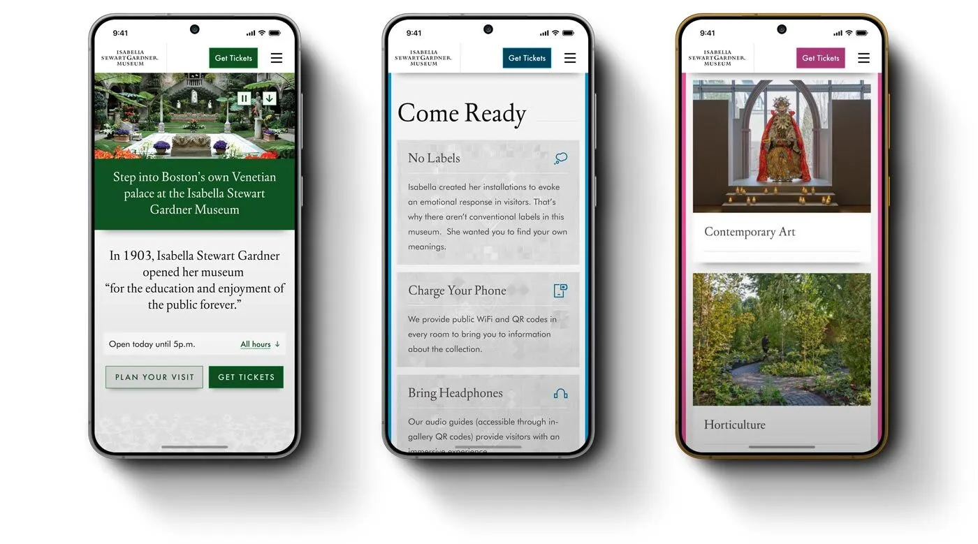
By translating the character into the system rather than decorating a template with it. The Gardner’s intimate, unconventional identity became a “gentle elegance” design language: lace patterns and mosaic elements in the components themselves, the Museum’s own rooms in the hero photography, and a Come Ready page that explains the no-labels experience in Isabella Gardner’s own intent.
How quickly does a museum website redesign change visitor behavior?
For the Isabella Stewart Gardner Museum rebuild by Pare & Co, within three weeks of launch: homepage engagement time up 15.6%, exhibition page views up 179.7% and engagement time on the Inside the Collection series up 61.7%. Staff now find and update content without external search tools, and the site won a w3 Silver among cultural institutions.
Client leadership

Jack Hartman
Jack Hartman’s specialty is cultural and destination platforms. He has led rebuilds for institutions whose audience already loves them and notices every change.