
Amplifying the Path to Help: A Problem Gambling Helpline Website for the Massachusetts Department of Public Health
Most people reach the Massachusetts Problem Gambling Helpline’s website in a hard moment, on a phone, and stay about fifteen seconds. The redesign treats that as the spec, not the problem.

In partnership with

The Challenge: A Helpline Website With Fifteen Seconds to Work
The Massachusetts Problem Gambling Helpline is run on behalf of the state’s Department of Public Health: a free, confidential line for people whose gambling has become a problem, and for the people who love them. Its website’s analytics described an audience unlike almost any other — 88% of its Massachusetts visitors on phones, three quarters of visits never leaving the homepage, an average stay of about fifteen seconds.
Most visitors arrive in a hard moment, with the stigma a majority of Americans still frame as moral weakness and with the narrowed attention a crisis imposes. The old site asked that audience to browse. The engagement, with strategy, design and build by Pare & Co and branding by Argus, was to build a site that asks almost nothing.
The Strategy: Every Route to Help, Before Any Scrolling
Design for the fifteen-second visit, and earn the contact.
- Two doors, tested first. “Find help for yourself” and “Find help for someone else” lead the architecture, validated in a 25-participant tree test before design began.
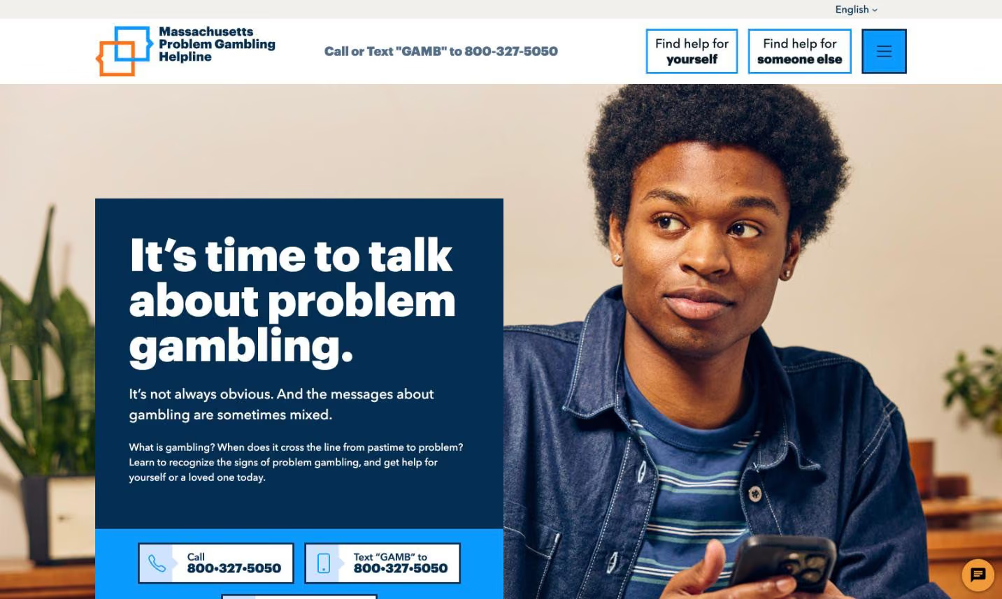
- Three routes to a human. Call, text and live chat surfaced in the content of every key page, always visible on mobile, with conversation openers so no one has to find first words.
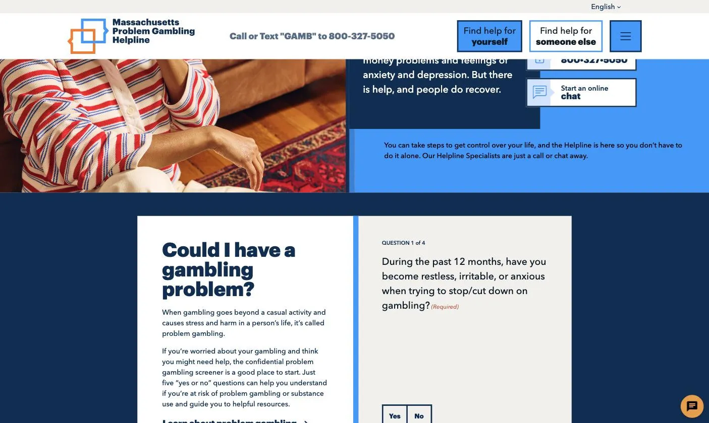
- A screener that lowers the ask. Confidential, embedded, one question at a time: “Could I have a gambling problem?”
- Trust made visible. The Department of Public Health’s backing stated plainly, confidentiality named on the pages people read before they reach out, natural photography and no browser-location requests.
- A rebuilt WordPress platform with accessible components and a glossary-backed translation architecture built to keep running costs low.
The Outcomes: Live in March 2026, in English and Spanish
A site for people who will only ever see one page of it. The new maproblemgamblinghelpline.org is mobile-first for the 88% of Massachusetts visitors who arrive on phones, and call, text and live chat are reachable from every key page, visible even with the menu closed. The state’s backing and the site’s confidentiality are stated on the pages people read before they reach out.
The architecture is the tested one: 25 participants across six tasks used the two doors as their launching point for nearly everything, and the launched site is organized the way they moved. Spanish shipped at launch on a translation architecture built to keep running costs low — and help is measurable now, with tel-link clicks tracked where the old analytics saw nothing.
The detail
Why it mattered
- Fifteen seconds, one page, on a phone. Analytics on the old site showed 78% of page views landing on the homepage, 75% of visits never reaching a second page, an average visit of about fifteen seconds and 88% of Massachusetts visitors arriving on a mobile device. Whatever the site had to say, it had that long to say it.
- Stigma is the second audience problem. A majority of Americans still attribute gambling problems to willpower or moral weakness, and the shame that follows makes asking a stranger for help a very large ask. The site had to lower it.
- Crisis narrows attention. Someone in a gambling crisis is often managing financial trouble, strained relationships and comorbidities at the same time. The ability to take in new information and choose among options is exactly what a crisis reduces, so density anywhere on the path to help is a cost.
- The state’s backing was an unused asset. Research from Argus, the Helpline’s branding agency, found that people who knew the Helpline was state-sponsored said that fact made them more likely to use it. The old site said so only in passing.
The call and the build
- Two doors, tested before they were built. The new architecture leads with “Find help for yourself” and “Find help for someone else.” A tree test with 25 participants, across ages 18 to 80 and most with some relationship to problem gambling, ran six tasks against the menu before design began, and participants used the two doors as their launching point for nearly everything.
- Three ways to reach a human, everywhere. Call, text and live chat are surfaced in the content of every key page, and on mobile the contact options stay visible even with the menu closed. The chat greets with a promise that a real person joins within a minute or two, and offers openers like “I just need to talk” so no one has to find first words.
- A screener that lowers the ask. The confidential problem-gambling screener sits directly on the find-help page, one question at a time, under a heading in the visitor’s own voice: “Could I have a gambling problem?” Self-help resources are kept distinct from meetings and formal treatment, because for a shame-sensitive audience downloading a toolkit and attending a meeting are different-sized steps.
- Trust built into the frame. The Department of Public Health’s backing is stated plainly, the photography is natural, and confidentiality language appears on the pages people read before they reach out. The services search stores a typed location for the session and never asks the browser for one.
- A rebuilt platform underneath. A custom WordPress theme replaced the legacy build: custom content types, accessible componentry to WCAG and a translation architecture pairing a front-end language switcher with a glossary-backed machine-translation service, so the site speaks Spanish at launch and its ongoing translation costs stay low. Branding came from Argus; strategy, design and build from Pare.
What moved
- Launched, and built for the visit the analytics describe. The new maproblemgamblinghelpline.org went live in March 2026, mobile-first for the 88% of Massachusetts visitors who arrive on phones, with the whole ask of the site answerable inside the fifteen seconds the analytics said it would get.
- Help is measurable now. Calls placed from the site were invisible to the old analytics; a custom event now tracks tel-link clicks, so the Helpline can see the site doing its one job.
- Tested with real people before a pixel of design. The two-door architecture went through moderated interviews, four personas, a six-site cohort analysis and a 25-participant tree test before visual design existed, which is why the launched site is organized the way testers actually moved.
Crisis helpline website questions
How do you design a website for people in crisis?
For the visit the analytics describe, and for what a crisis does to attention. On the Massachusetts Problem Gambling Helpline site, 88% of Massachusetts visitors arrive on a phone, three quarters never leave the first page and the average stay is about fifteen seconds — so every route to a human is on screen before any scrolling, and the whole ask of the site is answerable inside that first visit.
What should a helpline website put on its homepage?
The ways to reach a person. Call, text and live chat sit in the header and in the content of every key page, staying visible on mobile even with the menu closed, and the chat offers openers like “I just need to talk” so no one has to find first words. The two menu buttons are “Find help for yourself” and “Find help for someone else,” which is the whole top of the information architecture.
How do you test a crisis site’s information architecture?
Before any visual design exists. The two-door architecture built by Pare & Co for the Massachusetts Department of Public Health went through moderated interviews, four personas, a six-site cohort analysis and a 25-participant tree test running six tasks — and participants used the two doors as their launching point for nearly everything, which is why the launched site is organized the way testers actually moved.
How does a public health website support multiple languages affordably?
With a translation architecture rather than a parallel build: a front-end language switcher paired with a glossary-backed machine-translation service. The Helpline site spoke Spanish at launch, and its ongoing translation costs stay low.
Client leadership

Matthew O’Bryant
Matthew O’Bryant has led crisis-service platforms, where the person arriving is mid-decision and the path to help is the whole design.