Evolving an Identity to Match the Trust Already Earned: A Brand System for Out & Equal
Out & Equal advises the world’s largest employers on LGBTQ+ workplace belonging. The advice was sound; the brand around it read softer than the role required.
The work
The Challenge: The Brand Read Softer Than the Role
Out & Equal works with the world’s largest employers on LGBTQ+ belonging at work — convening them, training them and advising them on questions most organizations have no internal expertise to answer. Its standing rests on being read as a credible authority by corporate sponsors, member companies and the employees those companies are trying to support. That standing is doing more work than it used to. Out & Equal’s answer to whether it is the organization to take guidance from was strong; its identity answered a smaller question.
The Strategy: A Brand Identity System With Governance Built In
Start with what the organization is to the people it serves, then ask what an identity has to do to live up to it.
- Positioning first. A trusted guide through complexity, with clarity, confidence and care in one voice.
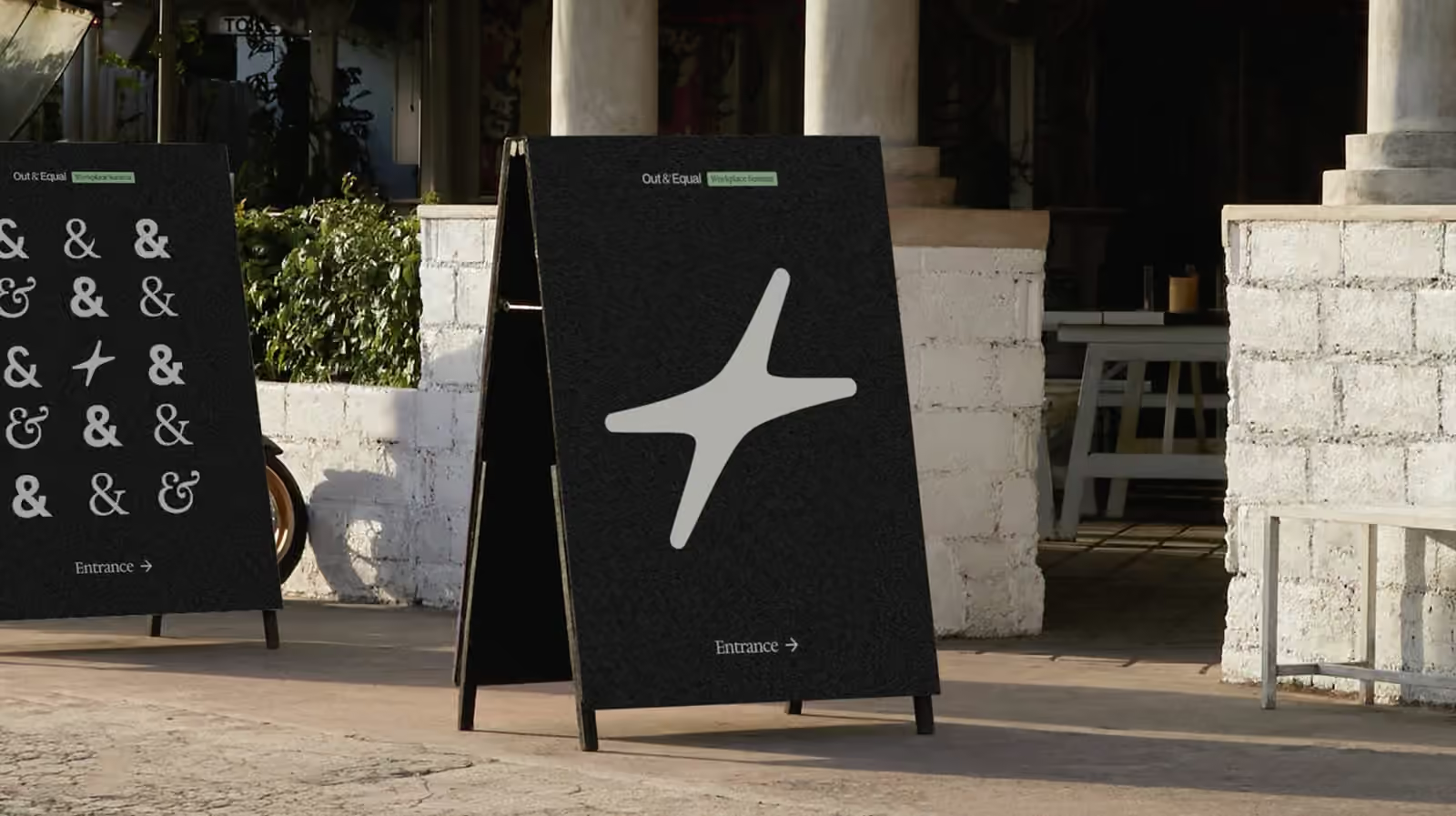
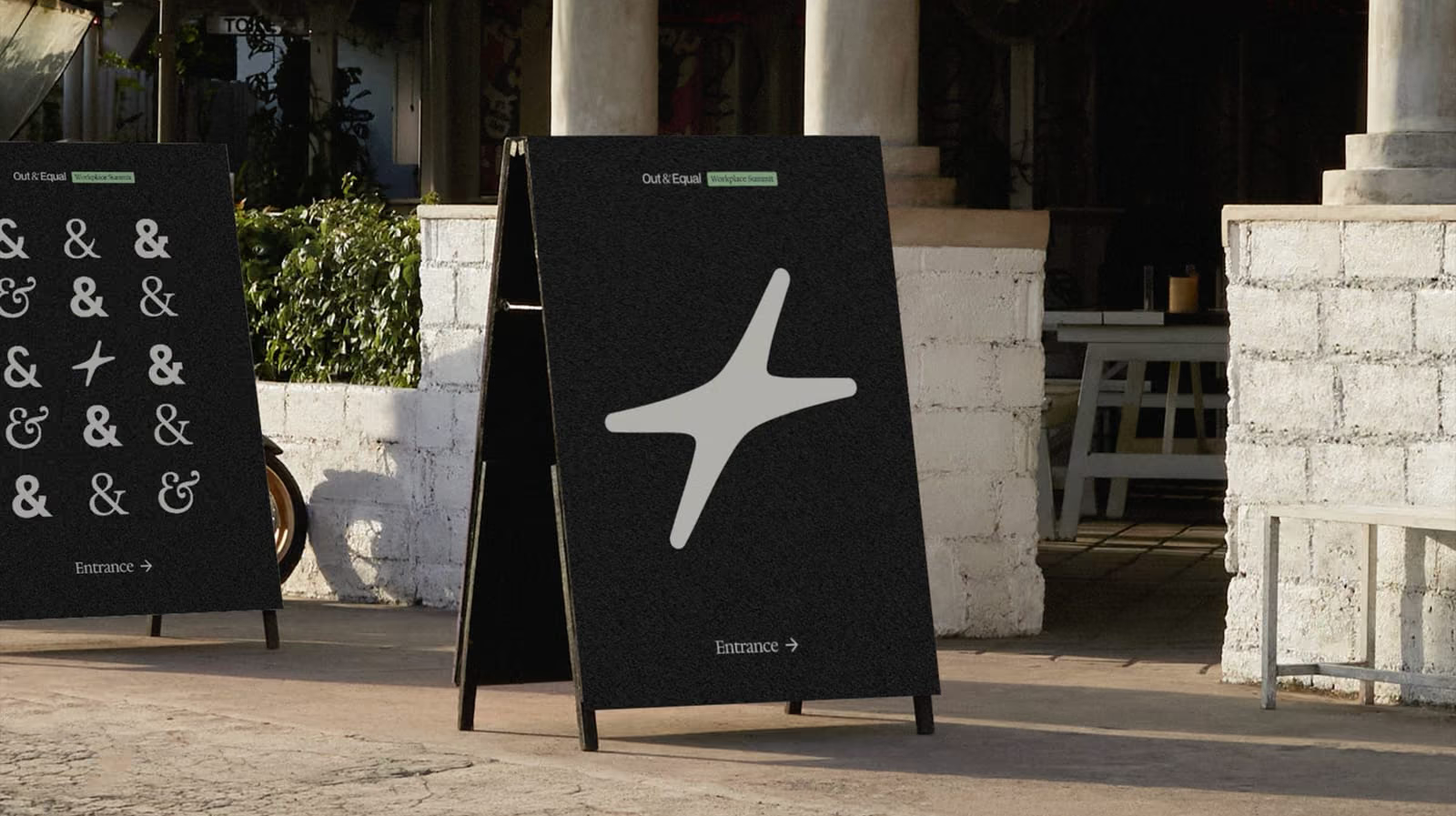
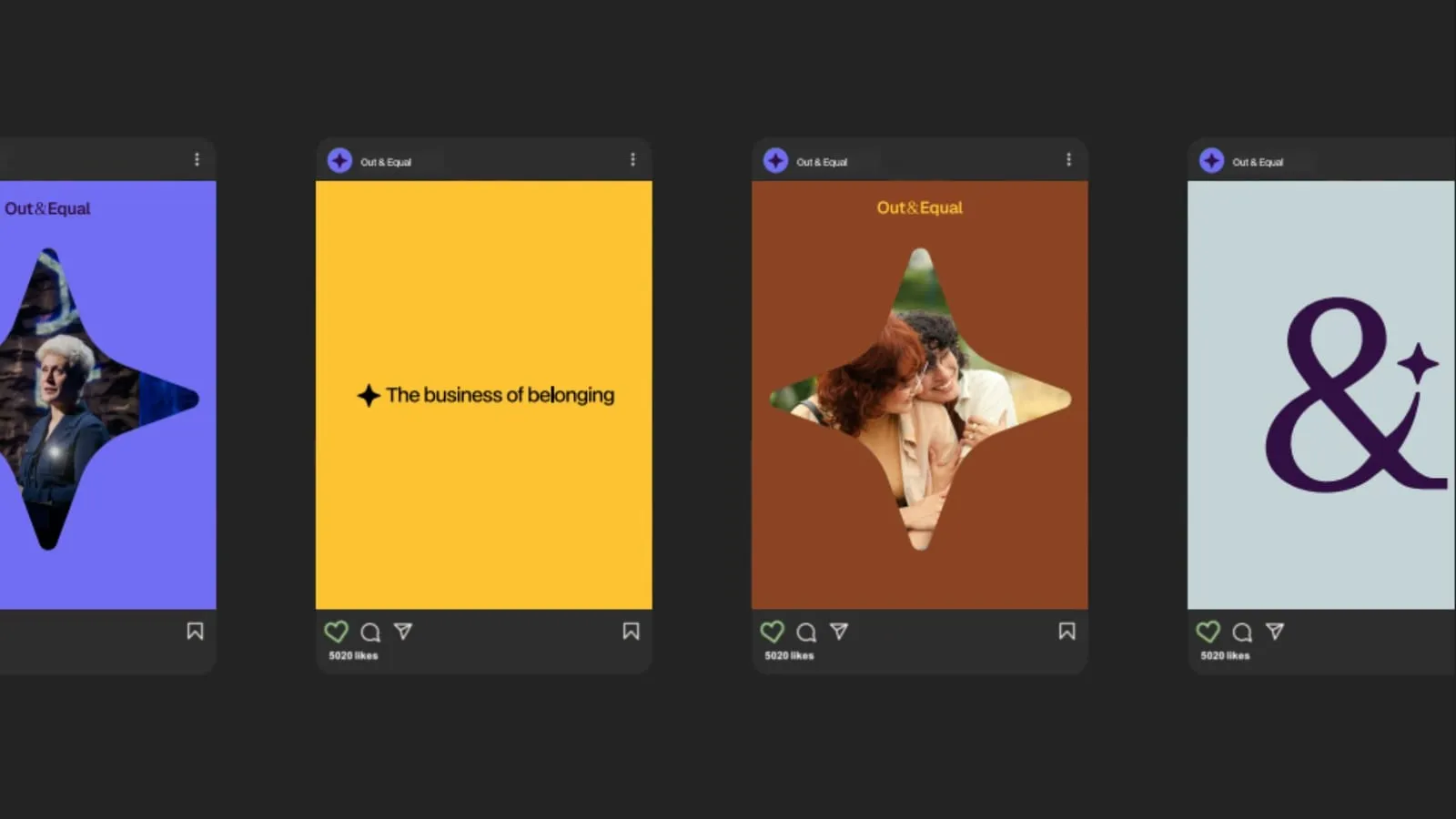
- A palette and a mark built to travel. Confidence alongside warmth, and a logo legible everywhere from a summit entrance board to a social tile.
- Storytelling as structure, so purpose, position and direction read in sequence rather than being assembled by the reader.
- Governance as a product. A central Brand Site as the single source of truth, with assets maintained in Figma by the designers who make them.
The Outcomes: An Identity That States the Role on Sight
A brand whose confidence matches the advice behind it.
- Trust | An identity that states the organization’s role on sight, under scrutiny rather than in spite of it | LGBTQ+ origins explicit rather than sanded off for corporate neutrality
- Engagement | One source of truth for guidelines and assets, used directly by internal teams and outside partners | Consistency across channels as the path of least resistance instead of an act of vigilance
The detail
Why it mattered
- The standing is doing more work than it used to. Scrutiny of this subject has intensified, and organizations that once adopted a position without much examination now examine it closely. The question a sponsor brings is no longer only whether they agree with the mission — it is whether this is the organization to take guidance from.
- The identity had accumulated rather than been designed. Expression varied across channels because there was no authoritative place to check what the brand actually was. Every new piece of collateral became a judgment call made under deadline by whoever was making it, and every judgment call moved the center slightly.
- The medium was making a claim about the message. An organization whose product is guidance cannot afford for its own materials to look uncertain. A brand that reads as tentative undercuts advice that is anything but.
- And the design team was the bottleneck on its own brand. With no governance, updating a guideline meant updating documents — and documents drift from each other the moment they are copied.
The call and the build
- Positioning before palette. The work started by naming what Out & Equal is to the organizations it serves — a trusted guide through complexity, with clarity, confidence and care in one voice — and then asking what an identity has to do to live up to that.
- A palette built for two things at once. Color chosen to signal confidence alongside warmth, because either one alone misrepresents the work.
- A refined logo, and a mark that travels. Better legibility and more adaptability across the range of contexts the mark has to survive — a summit entrance board, a social tile, a sponsor deck.
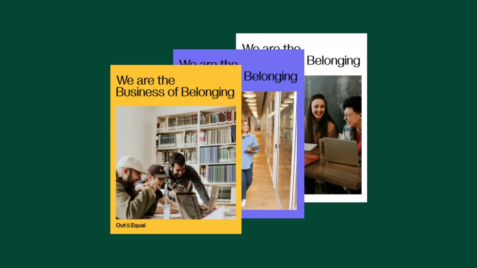
- Storytelling as structure. The narrative experience was redesigned so purpose, position and direction are legible in sequence — what the organization is for, where it stands, where it is going — instead of being distributed across pages and left for a reader to assemble.
- Governance as a product. The identity was operationalized through a central Brand Site: one source of truth for guidelines and assets that internal teams and outside partners work from directly. This is the piece that determines whether a rebrand lasts. A refresh with no authoritative home degrades from the day it launches, one reasonable local decision at a time.
- Assets maintained where they are made. Brand assets live in Figma and are updated by designers without an engineering ticket. The system stays current because keeping it current costs nothing, which is the only maintenance model that survives contact with a busy year.
What moved
- The identity states the role on sight. Which is the whole point of doing this under scrutiny rather than in spite of it. Sponsors and member companies meet a brand whose confidence matches the advice behind it.
- The origins stayed explicit. The roots of the work in LGBTQ+ organizing remain visible rather than sanded off in pursuit of corporate neutrality.
- Consistency became the path of least resistance. Internally the design team has a foundation to work from and a place to point people to. Expression stays consistent across channels because that is now the easy route rather than an act of vigilance.
- And it can change without fragmenting. The Brand Site and the Figma system mean the identity can evolve as the organization keeps changing, which it will, without paying for the change in coherence.
- Figma
Nonprofit brand identity questions
When should a nonprofit rebrand?
When the standing is doing more work than the identity can. Out & Equal’s advice was sound, but the brand around it had accumulated rather than been designed — expression varied by channel because there was no authoritative place to check what the brand was — and under intensified scrutiny, an organization whose product is guidance cannot afford materials that look uncertain.
What does a brand identity system include?
More than a logo. Out & Equal’s system pairs a refined, adaptable mark and a palette built for confidence and warmth with a redesigned storytelling structure — purpose, position and direction legible in sequence — and the operational layer: a central Brand Site as the single source of truth, with assets maintained in Figma by the designers who make them.
What is brand governance, and why does it matter?
The system that keeps an identity consistent after launch. A refresh with no authoritative home degrades from the day it ships, one reasonable local decision at a time. Out & Equal’s Brand Site gives internal teams and outside partners one place to work from, and because assets update in Figma without an engineering ticket, keeping the system current costs nothing — the only maintenance model that survives a busy year.
How do you rebrand without losing an organization’s roots?
Position before palette. The work began by naming what Out & Equal is to the organizations it serves and kept the roots of the work in LGBTQ+ organizing explicit rather than sanded off in pursuit of corporate neutrality — the origins stayed visible while the confidence caught up with the advice.
What results does a nonprofit rebrand deliver?
For the Out & Equal identity by Pare & Co: a brand that states the organization’s role on sight, under scrutiny rather than in spite of it; consistency across channels as the path of least resistance instead of an act of vigilance; and a system that can evolve as the organization keeps changing without paying for the change in coherence.
Client leadership

Doug Sisko
Doug Sisko co-founded Adapt USA and led its U.S. operations. He has led brand work for organizations whose recognition had outgrown their materials.