Converting Prospective Students Before They Visit: A Website for Keene State College
Higher education recruitment runs through the institutional website. For Keene State College, the existing site was built around the institution rather than around the prospective students it needed to recruit. We rebuilt it as a recruitment platform that serves the visitor who matters most — without losing the audiences who matter too.

The work
“This team brings creativity and structure to projects. Decisions are based on data and reports, but they include a connection to heart and real world users. They bring in subject matter experts at the appropriate time but never lose sight of the big picture.”
The Challenge: A College Website Built Around the Org Chart
A prospective student visits a college’s website many times before they apply, and forms the impression that follows them into every later interaction — which makes the site a recruitment platform whether or not it was built as one. Keene State College — a liberal arts institution within the University System of New Hampshire — had a site that had grown around the org chart instead, with every internal audience claiming a piece of the surface and the recruit getting whatever real estate was left.
The Strategy: An Audience-First Redesign, With the Prospective Student First
Rebuilt the site around the visitor doing the most strategically important work on it.
- Audience-first navigation, with prospective students as the primary audience. Admissions, programs and student life in the language a seventeen-year-old uses, rather than the institution’s internal taxonomy.
- A scalable mega menu. The depth of the offering is reachable without the entry experience taking all of it on at once.
- Prioritize without excluding. Faculty, parents, alumni and current students keep dedicated pathways, positioned for those audiences rather than competing for prospective-student real estate.
- A refreshed digital identity on a scalable design system. The brand modernized without losing the college, on a component library Keene State’s teams manage themselves — WCAG 2.1 AA and fully responsive throughout.
The Outcomes: A Recruitment Funnel Where a Directory Had Been
A site organized as a recruitment funnel rather than as a directory of the institution.
- Growth | Five main-navigation items, four of them prospective-student territory | Apply, financial aid and visit in the first content band after the hero
- Engagement | Programs entered through a question a seventeen-year-old is asking, not a catalog | Every other audience still keeps a designed pathway of its own
The detail
Why it mattered
- The site was built around the institution, not the recruit. The architecture reflected the org chart. A prospective student does not think in terms of academic affairs or student services; they think in terms of what it is like to study a subject here, and what their life would look like if they came. The navigation did not speak that language.
- Every internal audience had a claim on the surface. Departments, student services, donor-facing programs — the site had grown organically into a competition among internal stakeholders, and the prospective student got whatever real estate no one else had claimed. Serving everyone equally from the same surfaces served none of them well.
- A fragmented site was making a fragmented impression. Inconsistent branding and dated interface were forming the perception of the institution during the phase of the decision when perception matters most. A prospective student reading a dated site reads a dated college.
- The stakes are enrollment, not marketing. Demographic decline, public skepticism about cost and value, competition from larger and cheaper alternatives. For a small liberal arts college the website is doing work that a generation ago belonged to counselors, campus tours and printed viewbooks, and a site that is hard to navigate is a funnel with a leak in it.
How it was built
- Discovery found the roadblocks before the strategy chose the fixes. Stakeholder workshops, user journey mapping and content analysis surfaced the pattern: navigation that made admissions and program details hard to find, audiences competing for visibility, and an inconsistent brand weakening first impressions.
- Audience-first navigation, with prospective students first. The main navigation was built around what prospective students look for — admissions, academic programs, student life — in their language rather than the institution’s internal taxonomy. A scalable mega menu lets them see the depth of the offering without the entry experience taking all of it on at once.
- Prioritize does not mean exclude. Faculty, parents, alumni and current students kept dedicated pathways, positioned where they make sense for those audiences rather than competing for prospective-student real estate. The architecture serves several audiences distinctly; the hierarchy reflects what the institution most needs the site to do.
- A brand refresh that kept the college recognizable. The digital identity was modernized while staying true to the college’s brand — a first impression that reads current without reading like a different institution.
- A component library the college’s own teams run. A structured, flexible design system lets Keene State’s teams update and manage content while the visual identity stays cohesive — built to WCAG 2.1 AA, fully responsive and designed for long-term adaptability.
- Most higher-ed redesigns balance audiences equally, and that is the mistake. Equal navigation real estate for every stakeholder group produces a site that looks fair and functions for no one, because the audiences do not have equal strategic weight. Prospective students are the ones whose decisions determine the college’s future, and their experience has to be prioritized structurally rather than rhetorically.
What it looks like now
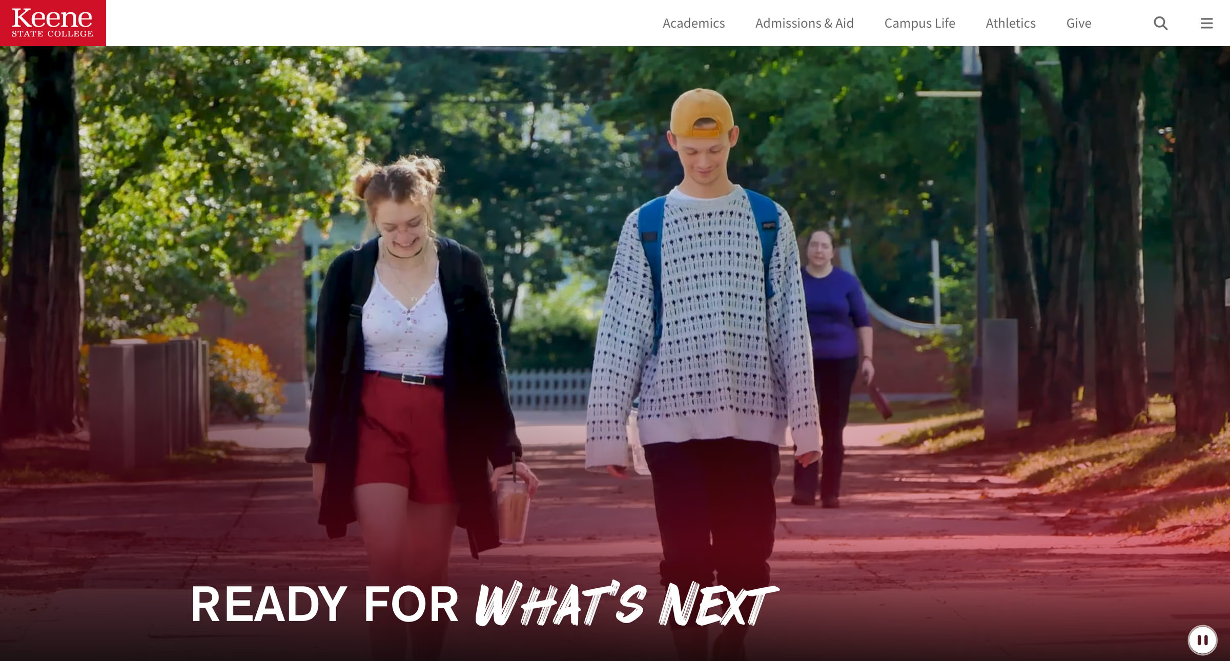
- Five items in the main navigation. Academics, Admissions & Aid, Campus Life, Athletics, Give. Four of the five are prospective-student territory and the fifth is the one audience an institution cannot fold into anyone else’s path.
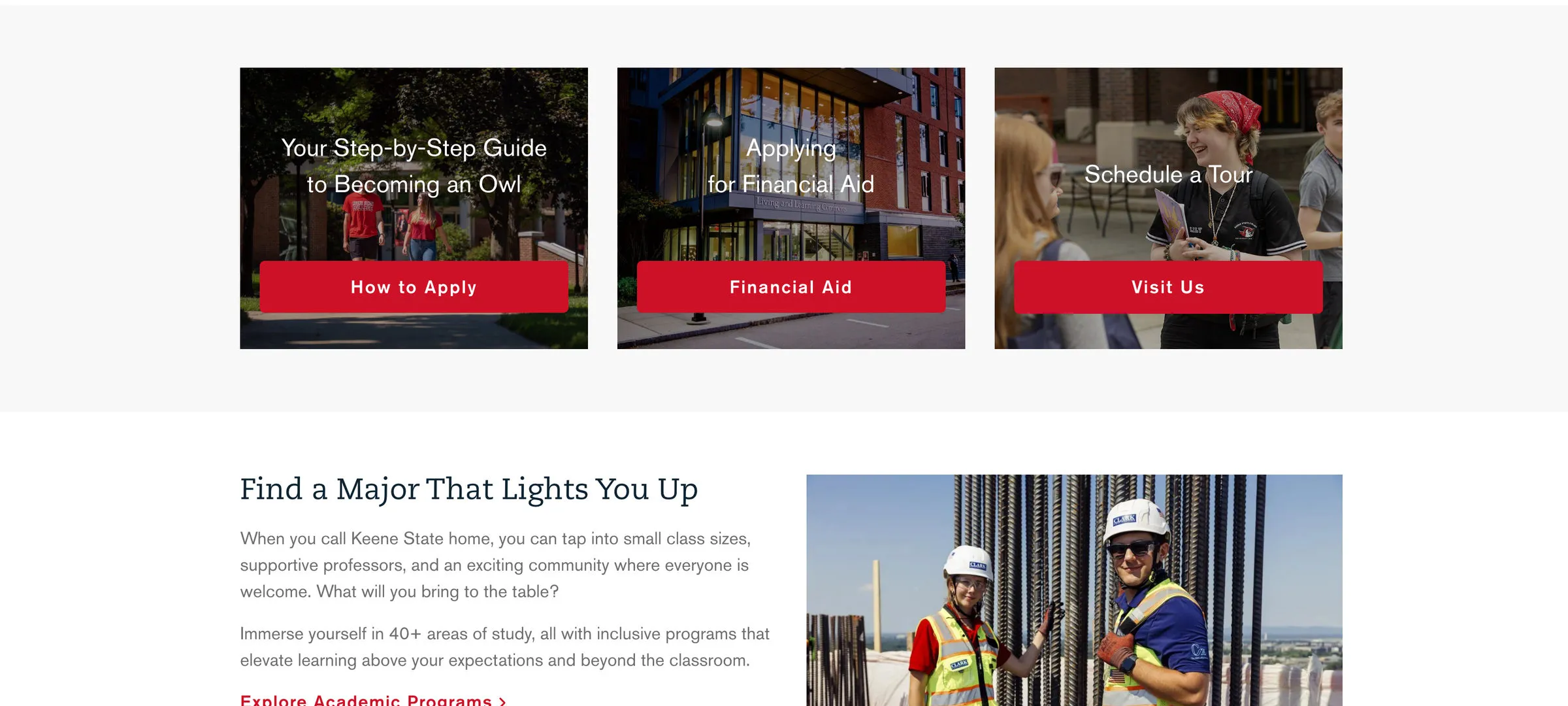
- The homepage opens on the funnel. How to Apply, Financial Aid, Visit Us — the three actions a prospective student takes next — sit in the first content band after the hero, ahead of institutional news.
- Programs are framed as a choice, not a catalog. “Find a Major That Lights You Up” leads into 40+ areas of study. The depth is there; the entry point is a question a seventeen-year-old is actually asking.
Higher education website redesign questions
How should a college website prioritize its audiences?
Structurally, not rhetorically — and not equally. Equal navigation real estate for every stakeholder group produces a site that looks fair and functions for no one. Prospective students are the audience whose decisions determine a college’s future, so Keene State’s site puts them first in the architecture while faculty, parents, alumni and current students keep dedicated pathways of their own.
What does a higher education website redesign include?
For Keene State College: discovery through stakeholder workshops, user journey mapping and content analysis; audience-first navigation with a scalable mega menu; a refresh of the digital identity that stayed true to the college’s brand; and a flexible component library the college’s teams manage themselves, built to WCAG 2.1 AA and fully responsive.
How do you organize college website navigation?
In the language of the student deciding, not the institution’s internal taxonomy. Keene State’s main navigation is five items — Academics, Admissions & Aid, Campus Life, Athletics, Give — four of them prospective-student territory, and the homepage’s first content band is How to Apply, Financial Aid and Visit Us: the three actions a prospective student takes next.
What makes a college website effective for recruitment?
For the Keene State College redesign by Pare & Co: a site organized as a recruitment funnel rather than a directory — admissions, academics and student life easy to find, a modernized identity making the first impression, and dedicated access points for every other audience — running live at keene.edu today on a design system the college’s own teams maintain.
Client leadership

Jack Hartman
Jack Hartman’s specialty is audience experience at institutional scale. He has led admissions work for universities, where the decision is often made before anyone visits.