
Redefining UX for Government Software: A Design System for Revenue Solutions
Tax-collection software for state and city governments doesn’t usually compete with consumer-facing products on user experience. We helped Revenue Solutions build a design system that made GOVERNMENT PREMIER one of the rare exceptions — and gave the product team what it needs to keep it that way as the platform evolves.

The work
The Challenge: Talent, Tooling and a Roadmap, With Nothing Joining Them
Revenue Solutions was betting that a tax-collection platform with consumer-grade experience would differentiate sharply in a category that is structurally slow to evolve — and government administrators run their day on GOVERNMENT PREMIER while taxpayers complete obligations through it, so the interfaces have real consequences. The company had design talent, design tooling and a roadmap, and nothing joining them: no rulebook, a foundation chosen but not enforced, QA with no standard to test against and UX debt growing faster than feature work could pay it down.
The Strategy: The Operating System First, Then the Screens
Invested in the operating system before the screens, on the position that without governance every screen generates as much debt as it relieves.
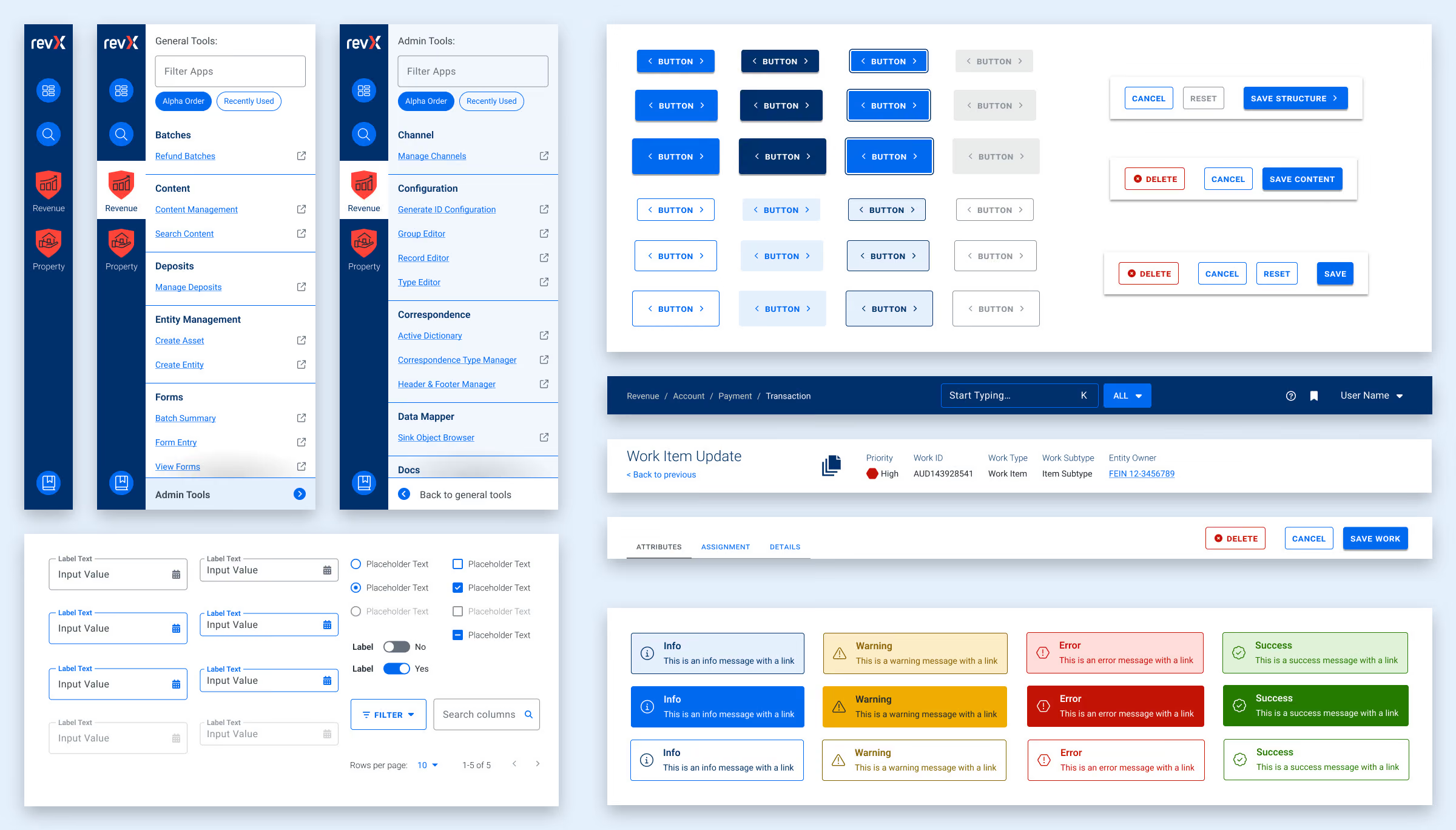
- A rulebook with explicit principles. Storybook as the source of truth, atomic design extended into pattern molecules, Material UI as the enforced foundation and interface conventions written down — destructive left, creative right, one primary focus per screen, long forms in chunks.
- A global design token system. Color, type, stateful feedback and spacing propagating automatically, with the palette consolidated from 55 colors to 24 and every one conformant to WCAG 2.2 AA.
- Tooling that enforces rather than describes. Storybook ships as a dependency of the product itself, so the system cannot drift into a file no one opens.
The Outcomes: A Design Practice the Product Team Runs From the Inside
A product organization that can ship consistent, accessible software at the pace the business needs, rather than a set of screens that were good once.
- Growth | 15 features and a dozen-plus mobile-responsive workflows designed inside the system | The design system operationally part of the product, so quality survives the next release
- Trust | 55 colors to 24, every one conformant to WCAG 2.2 AA | Interface conventions written down — finally giving QA a standard to test against
The detail
Why it mattered
- There was design talent, tooling and a roadmap, and nothing joining them. The team had the pieces. What it did not have was the structural connective tissue that makes the pieces add up instead of diverge.
- No design rulebook governing the system. Earlier UX work had produced patterns but not the principles that would allow them to extend coherently as the product grew. New screens did not reliably look like existing screens, and a decision made in one part of the platform did not propagate predictably to another.
- A design system chosen but not operationalized. Material UI had been picked as the foundation and then not enforced. Elements were over-engineered or duplicated, engineers built one-off workarounds for problems the design system should have solved, and each shortcut made the next one easier to justify.
- QA had no standard to test against. Without a rulebook, inconsistencies that should have been caught in design passed into engineering and then into production, because no one could point at the rule being broken.
- Teams moving forward, not in the same direction. Multiple teams executing the roadmap, each making reasonable local decisions, with no shared framework — so the platform’s coherence eroded even as features shipped. Familiar for a product organization growing past the point where one or two people can keep the whole experience in their heads, and expensive, because the debt grew faster than feature work could pay it down.
- The category makes it worse. Government software is structurally slow to evolve — long procurement cycles, conservative buyers, regulatory requirements that make every interface decision contested. Revenue Solutions’ bet was that consumer-grade experience would differentiate sharply in that category, which only pays off if the organization can ship it repeatedly.
How it was built
- The operating system first, then the screens. Most engagements in this position produce visible deliverables — feature designs, screen mocks, workflows — which generate output without changing the organization’s underlying capacity. The opposite position was taken here: without governance, tooling and ownership, every screen generates as much debt as it relieves.
- A rulebook with explicit principles. Storybook as the source of truth for components. Atomic design extended into larger pattern molecules. Material UI as the enforced foundation — the “build on the shoulders of giants” rule, which formalized a platform choice that had been made loosely. Interface conventions written down: destructive actions on the left and creative actions on the right, one primary focus per screen, long forms broken into chunks, color used deliberately for focus and alerts. The rules are revisited when usage shows one is stopping people completing tasks; the point is that they are written down.
- A global design token system. Colors, typography, stateful feedback and spacing converted to tokens that propagate across the platform automatically. The palette consolidated from 55 colors to 24 without losing a necessary distinction, every one contrast-conformant to WCAG 2.2 AA as a baseline. Accessibility in the tokens is accessibility that is structural rather than a final-pass check.
- Tooling that enforces the system rather than describing it. Storybook builds on Material UI instead of around it, and ships as a project dependency of GOVERNMENT PREMIER itself, often pinned to a version as the product evolves. Figma is the design system record; Storybook is the runtime enforcement. That is the difference between a design system in a file and one that is operationally part of the product — the second cannot drift.
- The fourth piece: an owner inside the building. An internal Design Manager was established at Revenue Solutions to lead the engineering team and maintain quality oversight of the design system — the role that keeps the rulebook, the tokens and the tooling aligned as the product evolves.
What the record already showed
- A playbook in the first month. Within the first month the teams agreed on a shared playbook, then expanded it across the engagement — with twice-weekly meetings with product owners across the company, and a seat at the table whenever a team was planning a new feature.
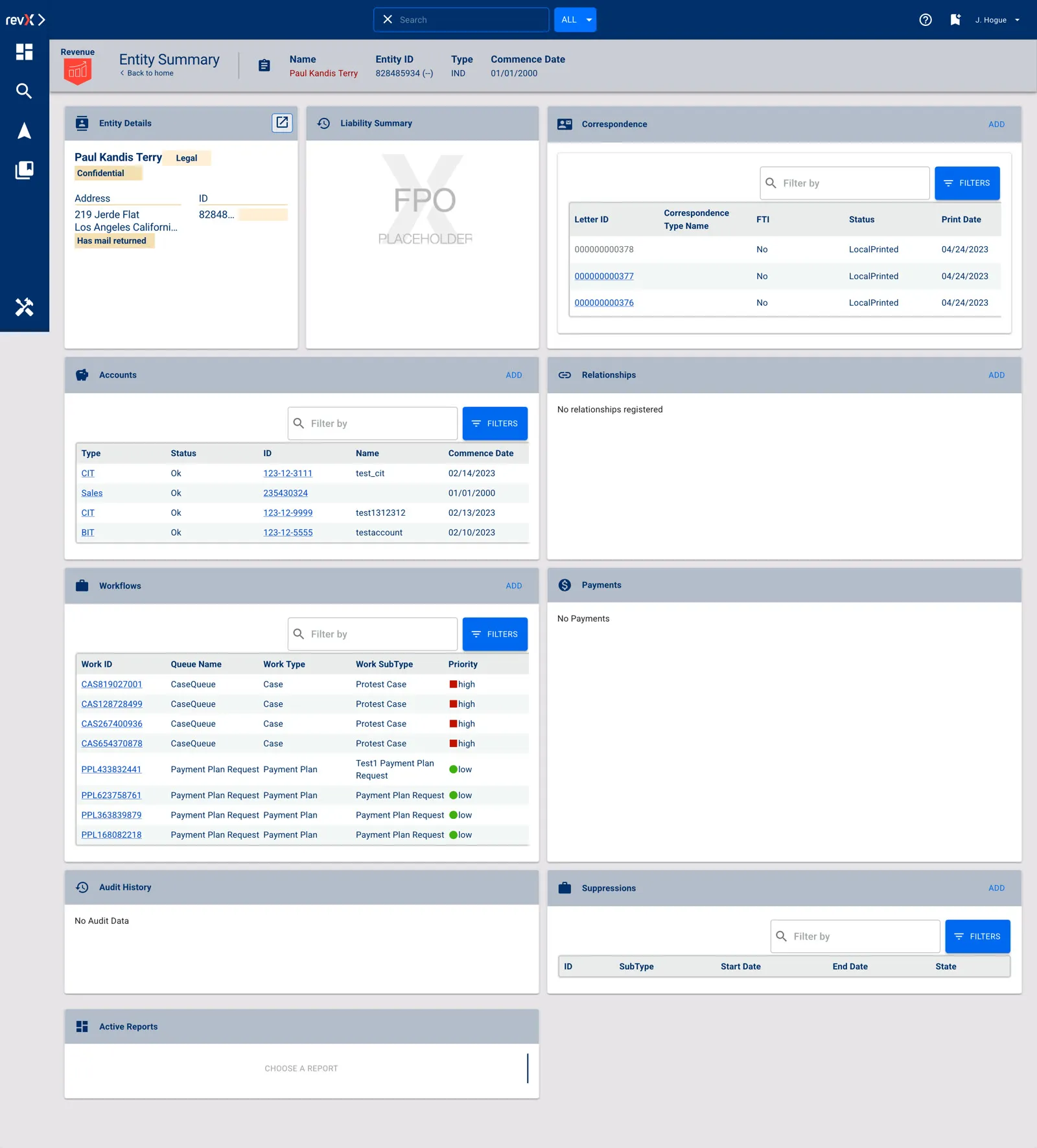
- Fifteen features and a dozen workflows. Designs completed for 15 GOVERNMENT PREMIER features, many spanning three or more screens or modals, plus over a dozen Online Services workflows designed with a mobile-responsive emphasis — the taxpayer-facing half of the platform.
Why this is the growth argument
- The differentiator is repeatability, not a screen. A tax-collection product with consumer-grade experience differentiates in a category where nothing else does. It only stays differentiated if the organization can produce that quality on the next release, and the one after.
- The users are not optional. Government administrators run their day on the platform and taxpayers complete their obligations through it. A missed payment, a confused workflow or an inaccessible form is friction that matters for citizens and is embarrassing for the agencies licensing the software.
- Storybook
Product design system questions
Why do product teams need a design-system rulebook?
Because without one, QA has no standard to test against and teams move forward without moving in the same direction. Earlier UX work at Revenue Solutions had produced patterns but not principles, so new screens did not reliably look like existing ones — and inconsistencies passed into production because no one could point at the rule being broken.
What belongs in a design token system?
Colors, typography, stateful feedback and spacing, converted to tokens that propagate across the platform automatically. For GOVERNMENT PREMIER the palette consolidated from 55 colors to 24 without losing a necessary distinction, every one contrast-conformant to WCAG 2.2 AA — accessibility as structure rather than a final-pass check.
How do you stop a design system from drifting?
Ship it as a dependency of the product. GOVERNMENT PREMIER’s Storybook builds on Material UI and is a project dependency of the application itself, often pinned to a version as the product evolves — the difference between a design system in a file and one that is operationally part of the product.
Who should own a design system internally?
Someone whose job it is. The engagement established an internal Design Manager at Revenue Solutions to lead the engineering team and maintain quality oversight of the design system — the piece that keeps the rulebook, the tokens and the tooling aligned after the consultants leave the room.
What does a mature product design system look like?
For the Revenue Solutions engagement by Pare & Co: a playbook agreed within the first month, 55 colors consolidated to 24 at WCAG 2.2 AA, designs completed for 15 GOVERNMENT PREMIER features and over a dozen mobile-responsive Online Services workflows, and a design practice the product team now runs from the inside.
Client leadership

Doug Sisko
Doug Sisko works on customer acquisition and the digital barriers in front of it. He has led design work for software sold into government, where the buyer and the user are different people.