
Uniting 17,000 Employees Around One Platform: An Employee Intranet for Brown University Health
Brown University Health’s 17,000 employees use their intranet for two different jobs every day — finding tools fast enough to administer care, and engaging with company culture deeply enough to feel connected to the institution. We built an intranet that does both, often in the same session, and Nielsen Norman Group named it one of the world’s ten best.
The work
The Challenge: One Hospital Intranet, Two Speeds, 17,000 Daily Users
Half a million patients are cared for annually across Brown University Health (then Lifespan), and 17,000 employees use its intranet every day, from doctors and nurses to administrative staff and third-party vendors. Behind the front door sit 164 departments, 430 job and clinical tools and a directory of 40,000 staff contacts.
The intranet has two jobs with opposite failure modes. It has to disappear: a nurse between patient encounters, at a shared workstation, needs a protocol or a colleague fast enough that the platform does not slow the care. And it has to be present, because an institution that size does not cohere without shared news, events and recognition. Task-optimized intranets feel sterile; culture-optimized ones feel slow. Most pick one.
By 2021 there were structural reasons to rebuild as well. A decade of work patterns had moved underneath the information architecture, the version it ran on was approaching end-of-life, and COVID-19 had made a question urgent that a security-first, HIPAA-compliant intranet was never designed around: could it be reachable from home?
The Strategy: One Intranet Designed for Speed and for Browsing
Design the dichotomy in, on Drupal: two modes the platform serves on purpose rather than a compromise between competing requirements.
- Discovery surfaced the dichotomy rather than assuming it. Stakeholder workshops, five personas, one-on-one interviews and an organization-wide survey produced the pattern the architecture was built on: speed to a destination, and unstructured browsing, often from the same person in the same session.
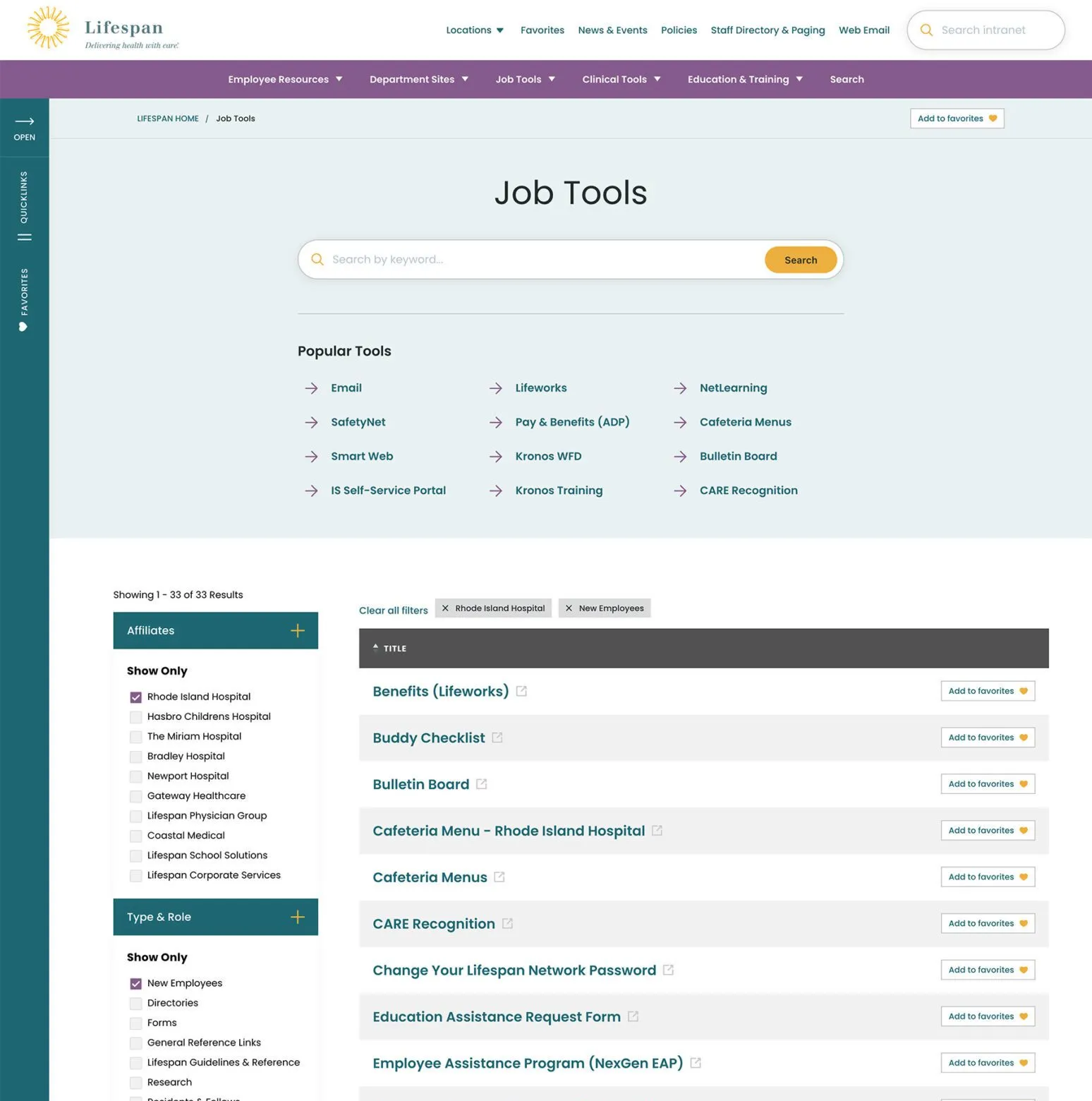
- Search as the spine. Learn once, use everywhere: tools, forms, people, departments and locations share one interface structure and one set of filtering patterns, with popular searches as smart defaults so the common cases end before they become searches.
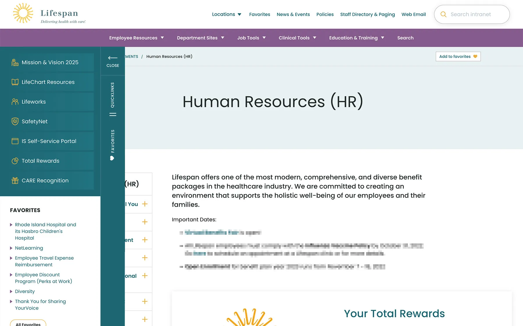
- Personalization that follows the employee. Single sign-on from personal devices and shared workstations, with transportable favorites: six always in the left drawer, the full list one click away, so a task started on one machine picks up on another.
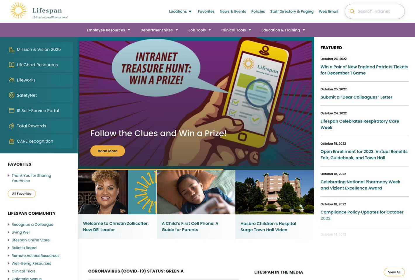
- A Dashboard for either intention. The drawer opens by default with seven curated links, timesheets beside the CARE recognition program; the rest of the page runs featured stories, events and flexible culture sections.
The Outcomes: One of the World’s Ten Best Intranets
Nielsen Norman Group named the intranet to its 2023 Intranet Design Annual: ten winners, chosen worldwide. It is the study’s external verdict, and the internal ones agree with it.
Adoption was the first. The legacy tools and directories stayed available through a launch overlap, and employees moved to the new tools quickly anyway, the migration pattern institutions hope for and rarely get. The second was mobile: once the intranet became reachable off the closed hospital network, mobile traffic rose dramatically, to over a million page views a month platform-wide. And inside that traffic is the pattern the whole design argued for: employees engage with culture content on their personal devices and use hospital workstations for their tasks — two modes, each on the surface that suits it.
The platform keeps evolving. We have supported the intranet continuously since launch, iterating features and evolving the toolset for the people who use it every day.
The detail
Two jobs, one platform, and most intranets pick one
- Speed, because the intranet sits between care interactions. Clinical staff use the platform between patient encounters, often at shared workstations, often under time pressure. A nurse logging a medication, finding a diagnostic protocol or reaching a specialist colleague needs the intranet to disappear — to hand over what they came for fast enough that the platform does not slow the care.
- And slow, because a 17,000-person institution runs on culture. Shared narrative, shared events, recognition of each other’s work, belonging. That work happens through the digital surface employees actually use daily. An intranet that is all task and no culture produces the institutional experience of working somewhere that does not have one.
- The two failure modes are opposite, which is why this is hard. Task-optimized intranets feel sterile and produce institutions where employees do not know each other’s names or what is happening across the organization. Culture-optimized intranets feel busy and slow, and frustrate clinical staff trying to do their jobs. The only way to get both is to design for the dichotomy explicitly rather than to compromise between two requirements.
Why it mattered
- A decade of work patterns had moved underneath the architecture. What employees needed to do, how they needed to find it, and which tools were part of the daily workflow had all changed since the previous intranet was built. New tools, tasks and internal audiences had appeared, and the information architecture no longer reflected how the institution worked.
- Where the work happens had changed permanently. A security-first, HIPAA-compliant intranet that had lived inside the institution’s closed network now had to be reachable from home and personal devices. COVID-19 turned that from a question into a requirement, and the assumption that intranet access meant a hospital workstation was no longer compatible with how the institution operated.
- The version it ran on was approaching end-of-life. So re-architecture was not optional in the long term — and the moment of re-architecture was the right opportunity to take on the structural design questions that incremental updates could not.
How it was built
- Discovery surfaced the dichotomy rather than assuming it. Stakeholder workshops, five employee personas, one-on-one interviews with key persona types and an organization-wide survey produced a clear pattern: some tasks need speed to a destination, and some need unstructured browsing. Employees do both, often in the same session.
- Search as the spine: learn once, use everywhere. Tools, forms, people, departments and locations all search through the same interface structure and the same filtering patterns. Each search page opens with popular searches and the most-needed content as smart defaults, so in many cases an employee finds what they need without searching at all.
- Personalization that follows the employee between devices. Single sign-on works from personal devices and from shared hospital workstations, so a task started on one machine picks up on another. Favorites are transportable bookmarks — almost everything on the site can be favorited, six are always available in the left drawer, and the full list is one more click away.
- A Dashboard for either intention. The landing page does not know whether an employee needs something immediate or has time to explore, so it serves both: the drawer open by default with seven curated links — timesheets beside the CARE recognition program — favorites beneath them, and the rest of the page running featured stories, quick news, events and flexible culture sections.
The relationship behind it
- Since 2010, and the intranet before this one. The firm has worked with the institution since 2010 and built the previous version of this intranet. Operating a platform for a decade is what made the two-mode pattern visible in the first place, and the work continues — iterating features and evolving the toolset.
News & Recognition
- December 2025
Two DANDA Silvers in the awards’ fourth season
Silver in the Website category for Brown University Health, and a second Silver for the Oncology Nursing Foundation — our third and fourth DANDA honors.
- July 2023
Lifespan’s intranet is one of the ten best in the world
Nielsen Norman Group has named the Lifespan intranet to its 2023 Intranet Design Annual — ten winners chosen worldwide, after eighteen months of research, design and build.
Healthcare intranet design questions
What makes healthcare intranet design different?
The conditions of use. Clinical staff reach the intranet between patient encounters, often at shared workstations, often under time pressure, so speed to a policy, a tool or a colleague is a patient-care concern rather than a convenience. The platform is HIPAA-compliant and security-first at the same time — and it still has to do the culture work any 17,000-person institution needs from the surface its employees use every day.
How do you design an intranet for both tasks and company culture?
As two modes served on purpose, not a compromise between them. On the Brown University Health intranet, the Dashboard opens with a drawer of curated quick links and personal favorites for the employee in a hurry, while the rest of the page runs featured news, events and recognition for the employee with a minute to browse. Task-optimized intranets feel sterile and culture-optimized ones feel slow; designing for the dichotomy explicitly is what avoids both.
Can a HIPAA-compliant intranet be available from home?
Yes. The Brown University Health intranet moved off the closed hospital network, with single sign-on from personal devices as well as shared workstations, and favorites that follow the employee from one device to another. Usage confirmed the design: mobile traffic rose dramatically, and employees engage with culture content on their personal devices while using workstations for tasks.
How should intranet search be designed?
Learn once, use everywhere. On the Brown University Health intranet, tools, forms, people, departments and locations all search through the same structure and the same filtering patterns, so a skill learned on one screen works on every other. Each search page opens with popular searches and the most-needed content as smart defaults — often what an employee came for is on screen before they type.
What does a successful intranet redesign look like?
For the Brown University Health intranet by Pare & Co: a place in Nielsen Norman Group’s ten best intranets in the world for 2023, quick adoption over the legacy tools that stayed available through the launch overlap, and a dramatic rise in mobile traffic once the platform became reachable off the closed network — over a million page views a month.
Client leadership

Matthew O’Bryant
Matthew O’Bryant’s specialty is federation-scale platforms — one system serving seventeen thousand people who each work somewhere different inside it.